Monday, May 23, 2011

The Hunger Games


Katniss from The Hunger Games © Suzanne Collins
By Corey Breen
Pencil


Katniss from The Hunger Games © Suzanne Collins
By Corey Breen
Pencil


Katniss from The Hunger Games © Suzanne Collins
Entertainment Weekly


Katniss from The Hunger Games © Suzanne Collins
Entertainment Weekly


Katniss from The Hunger Games © Suzanne Collins
Entertainment Weekly

Here is a drawing of one of my FAVORITE new characters, Katniss from the Hunger Games books by Suzanne Collins. Been meaning to draw her ever since I read the AMAZING books. Finally got around to it after Entertainment Weekly posted the first pics from the upcoming movie. So psyched for this movie, it seems they are doing everything RIGHT, including the casting of Jennifer Lawrence! Wow, does she look the part or WHAT?

I recommend these three novels more then you can possibly imagine. Great writing, great characterization, and a fascinating page turner, and one of the best series I've ever read! Hope you like, I tried two different facial expressions on this one.

Corey

Wednesday, May 18, 2011

Supergirl Revised


Supergirl © DC Comics

Revised Color
By Corey Breen

Photoshop

Wish I Could Fly Like Supergirl!


Supergirl © DC Comics

By Corey Breen
Photoshop


Supergirl © DC Comics
By Corey Breen
Digital Inks in Photoshop


Supergirl © DC Comics

By Corey Breen
Pencil

Was just killing time, and decided to redesign Supergirl. I wanted something more retro, so I went with a VERY simple yet padded body suit. Much like my Superman redesign, I picture the Superman Family to have outfits that are sleek like The Flash and like swimmers in real life. The cape is the only thing that should be flowing from Superman or Supergirl. As cute as her mini-skirt is, and as much as I love drawing heart a hint of panties (heh he), it just doesn't make sense. Neither does the bike shorts under the mini-skirt. That is just dumb. She's not playing field hockey. lol

I always think too, that the more clothes on a female character, the sexier they are; I dunno, I just do sometimes.

So, hope you like it. Couple last notes on this though. One, as you can see, I did the inks digitally on my Cintique. Two, while coloring it, I played around with different hairstyles and then completely flopped the head horizontally. I think that works better. Let me know what you think!

Corey


Here is the other version, with her head the other way, just in case you want to compare:


Supergirl © DC Comics
By Corey Breen
Photoshop

Tuesday, May 17, 2011

Robin & Batman

Robin & Batman © DC Comics
By Corey Breen
Pencil

Robin has always been a character that has been near and dear to me my whole life. I grew up loving Robin, ever since I started following Tim Drake in the 90's when he found out that Bruce was Batman. I always wanted to BE Robin, and like a lot of kids, found it very plausible. So I always get weary of how they handle him in the funny books, even though I realize now that I can never be him (anymore at least).

That's why I thought I would HATE this NEW Robin, Bruce's son, Damien. BUT, much to my surprise, I think he is AWESOME! Love the character, love his attitude, and love that he still needs to redeem himself, and also make up for ALL his parents' faults, including Ra's Al Ghul.

So he is just a quick sketch of the new Robin... LOVE the hood too, nice touch!

Enjoy

CjB

Friday, May 6, 2011

THOR!


Thor © Marvel Comics
By Corey Breen
Photoshop

This is a piece I did a long time ago, but just decided to color it in honor of the Thor movie coming out in theaters today! I hope to hit up Free Comic Book Day tomorrow and then the movie but it all depends on how the wifey is feeling, being pregnant and all.

Hope you enjoy the movie if you see it, and definitely hit up the comic store, and support Free Comic Day!

Corey

Monday, May 2, 2011

Wednesday, April 20, 2011

"Here's your pan, here's your frog."


Tangled © Disney 2011
By Corey Breen
Pencil


Disney Time Line

Finally got around to see Tangled, bought it on Blu-Ray. I absolutely LOVED it. I definitely miss the old Disney hand drawn style, but this was their first movie that had that feel of those, and that cartoony look, just done in computer generated style too. I think it worked. I loved the Broadway feel to it, I hope they make a musical out of it. I loved the story too. Just a really great movie. So much like all the things I watch that I love, I did a drawing of Rapunzel! Hope you like it!

I also included a pin-up I got in I think EW, that is a time line of EVER Disney carton. Perfect for a record of all their films, and great reference of them and when they came out.

If you haven't seen it yet, rent, or better yet, BUY Tangled.

Until next time,

CjB

PS- Happy 4th Birthday, Finley! Hope it was a good one, and have fun in Disney World!

Friday, April 8, 2011

Go Go Gadget DO OVER!


Inspector Gadget ©
DIC Entertainment
By Corey Breen
Pen & Ink & Marker & Photoshop


Inspector Gadget © DIC Entertainment
By Corey Breen
Pencil

So this is more what I had in mind when I said I wanted to try to do a cool Noir Inspector Gadget. Still not as dark and moody as I was hoping for, but now you kind of get the picture.

At least you can see two different styles of mine, and some of my process. Let me know what you think, please.

Thanks,

CjB

Friday, April 1, 2011

I just had to share this!

Last night I was working on my Concept Art portfolio, coming up with new characters and costumes and the like, when I took a five minute break to look at some reference and to get some inspiration. What I read, I just HAD to share today. This one artist put into words my WHOLE philosophy of comic art and design.

I do a lot of photo realistic work for freelance and for different clients, but for my comic work and now video game experimentation, it's hard to explain my "style". Probably since college, I have been trying to put my philosophy into words. SO many times I would get critiqued, and not that I didn't appreciate it, but a lot of times, the reviewer just didn't understand my style, my exaggerations and my reasoning behind a lot of my art. I got a lot of, "oh, an arm wouldn't do that in real life", or "draw more 'realistic' comic book heroes". I finally found an artist that explains EVERYTHING I truly aspire to. He did it for me, and I have to THANK him for that.

The artist is Skottie Young, and this quote came from his OZ PRIMER book published by Marvel Comics. Please read this, and know that I am forever in his debt for putting into words what I could not. Much like Skottie, I am not saying this is how everyone should treat their art, but this is exactly what I do, and why my art is what it is.

Questionnaire: Do you think your style lends itself to the kind of evolution it has gone through, more so then it would for a more "realistic" artist?

Skottie Young: Well, I can't really compare because I've never been able to draw in that other way. I'm not a representational artist. I consider myself a cartoonist. Rather then draw what the world looks like, I prefer to draw want I want this other world to look like. The good news about that is it gives me a big playground to work in. I can stretch the mouth to look like an inner tube, or just make it a little line. SO in a way, it's not whether or not it's easier to evolve, it's just whether or not I can push a little further.

When I was younger, I heard the term "too cartoony" thrown around a lot. It made me nervous that I needed to tighten up and refine my work. The times I tried that I felt very limited. I mean, my hat's off to the guys that can do that. I'm not trying to say what I do is better. It's just that this is what I'm capable of doing. When I've tried to draw more realistically, it wasn't fun. Instead of imagining things, I felt I was trying to mimic things.

So within the frame work of what I do, it's about challenging myself to see what else I am capable of. And there are a lot of failures that people don't see. By no means does every new thing I try come out great.

Thank you Skottie Young, I could not have said it better myself. You were a HUGE inspiration to me before I read this article about you, but now, even more so.

Thank you for letting me share.

Now, back to work,

CjB

Thursday, March 31, 2011

DO DO DO DO DO, Inspector Gadget...


Inspector Gadget © DIC Entertainment
By Corey Breen
Pencil

I intended to try and draw an Inspector Gadget that was a realistic, Noir re-imagining, but this is what came out. My style crept in and took over, and I was no where near the dark, Sin City-esq piece I wanted to do. Now that I have drawn the character, I may try again. But I do like how this piece came out, and it was a lot of fun, so not a total loss. And it was just a quick warm up piece, so can't really stress about it.

Hope you like it none-the-less!

CjB

Monday, March 21, 2011

Let me take another shot at this!


Superman © DC Comics
Redesign by Corey Breen
Photoshop

So after talking with Dezi and some other coworkers on my redesign, we started playing with the costume even further. Above is what we came up with. You see, I wanted to create more of a jump suit for superman, much like the Flash or Aquaman has. Superman should be like a swimmer. He is super fast, and should look like a red and blue blur that zips by. He has no need for boots, or freakin underwear. If what they say is true, much like the fast, he is so fast, that if he stood still, it would be hard to even focus on him. Superman should be sleek and regal.

I think he looks that hear. Although, if this suit was translated to live action, please don't make it "plastic-y", lol. Thinking about it more, maybe it's "too much blue" in hear as well, we all know now what that could look like.

Let me know what you think,

CjB

Friday, March 18, 2011

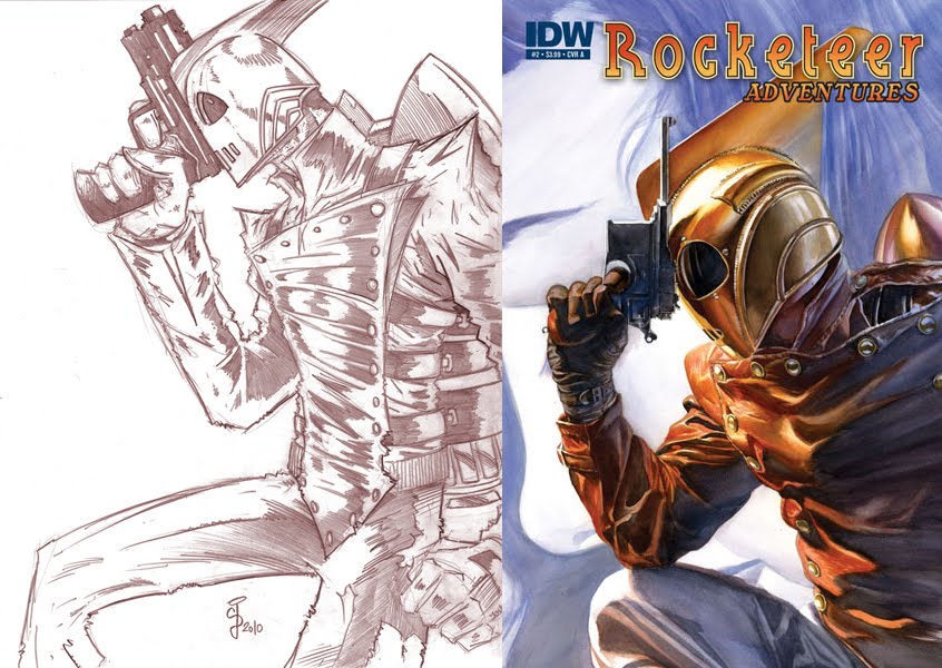
Swipe File? LOL


The Rocketeer © Dave Stevens
By Corey Breen (left) & Alex Ross (right)

Did Alex Ross SWIPE my Rocketeer drawing?! Well, no, I highly DOUBT it. But I saw this today, and had to do a side-by-side comparison just to see. It is kinda eerie, but in NO WAY do I think it's a swipe, at all. I mean, for one, there is probably no way in hell he's ever seen this piece of my work before, and two, it's not exactly the same anyway. It's not a direct copy at all.

This happens sometimes in our field, where one image is slightly like another. I mean, there are only so many positions to draw these heroes in anymore after 75 years, you know? I actually got accused once by a Top Cow editor of swiping a position. But honestly, I didn't. I was in college at the time, and I have never seen this promo image that circulated months after I drew mine. It was only similar anyway, no where near the exact same. You could totally tell both were drawn from our heads. Both done around the exact same time as well, so there was no way either me or the artist knew of the others' drawing. It happens sometimes. Nothing you can worry about.

REAL swipes are the blatant tracings of other people's drawings or photographs. Not something like the above, where it's a classic pose and the two pieces are just similar in nature.

Well, there you have it,

CjB

Thursday, March 17, 2011

Video Games are Better then Movies!


Liara from Mass Effect 2 © Bioware
By Corey Breen
Pencil

They just are, sorry.

Just finished Mass Effect 2, and it was AMAZING! Star Wars slash Battlestar Galactica slash Final Fantasy! This game just blew my mind. No doubt I am late to the party on this one, since it was first Mass Effect and Mass Effect 2 for the XBox, but I have a PS3 and it didn't come out for PS3 until about two months ago. I spent 70 hours on this game, and I wish it was even longer. One of the few games where I want to collect ALL the trophies, AND/OR play it ALL again. I don't usually have the time or effort to ever do that, but with this game, I REALLY want to. Even my favorite games (Zelda - Ocarina of Time was the only one I've ever played completely through twice, I think).

Mass Effect 2 was SO inspiring and SO motivating to me, it's beyond words. Can't say enough about this game. It has really elevated my brain as I go deeper into creating my own world, as I have discussed I am working on.

So enjoy my very quick (half hour) sketch of Liara from Mass Effect 2 or in other words, my VIDEO GAME GIRLFRIEND, lol. [My wife HATES that I have a video game girlfriend.]

Now it's off to working on my creation, and also begin playing Dragon Age 2, which is like Mass Effect 2, but with Dragons and Medieval Times! So psyched.

Until Next Time,

CjB

Wednesday, March 16, 2011

Superman Redesigned!


Superman © DC Comics
Redesign by Corey Breen
Photoshop Color


Superman © DC Comics
Redesign by Corey Breen
Pencil

As we usually do at work, my coworkers and I started arguing about comics and comic book movies. When the Superman Movie news came out the other week, we started arguing about how the new movie could be better then the Bryan Singer version. It spilled over into a conversation about comics and I mentioned that I hate Superman's costume, so the movie and the comics should start there. My coworkers said, no, no, you can't change Superman's costume because it's classic and that's what it is. I came back and said, fine, it really shouldn't be changed, but can we at LEAST just get rid of the underwear?! I HATE superheroes with the underwear on the outside of the costume. As Karl Pilkington would say, "get rid of it!".

I couldn't convinced my friend Dezi that I could make it better just by getting rid of the underwear. He said prove it. Draw it up, and color it (he didn't think the colors would work if you got rid of the red undies).

So here ya go, Dezi. In color!

I like it, I think it works. Makes him look regal, and still has all the elements of the classic Superman costume, just no belt and NO UNDERWEAR! He actually looks his age, not some silly boy scout, campy loser. I like the pointed shoulders too, like a military general's tunic. Makes him look government-ish, without losing the freedom of the classic look.

Let me know if you agree!

Until next time,

Corey Breen

Thursday, February 10, 2011

Color Makes Old Things NEW Again!


St. Walker Blue Lantern © DC Comics

By Corey Breen
Photoshop

Finally got around to coloring this piece. It always looks so much more vibrant on my cintque and when I'm coloring it then it does when I finalize it andd post it. I gotta figure out why that is. Either way, I hope you like it.

Still working on the Tron piece, but kinda hit a low in motivation these past two weeks, so you'll have to wait a little longer for that. I am working on SaricH right now, so that's good news!

Doesn't look like I'll reach my goal of having a book out for it by the convention in October, but I should at least have a six page preview completely done. I did the thumbnails for that, and now I just have to draw it. It's a cool little introduction to SaricH and his world, so looking forward to jumping into that. After the six page preview, i will be doing working on the entire design of the characters and world before I go into making the book for it. I want to treat it as if it was going to be a video game, and design it all from the ground up. I want to get it to a point where you see everything like in the Art of Books of a video game, for example. It's gonna be fun.

Until then,

Corey OUT!

Share

Share/Bookmark