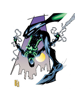
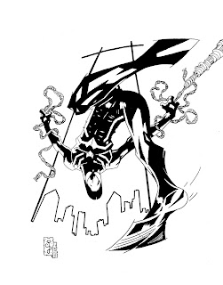
Neon Spider-Man © Marvel Comics
By Corey Breen
Inks, Colors done in CS3
The next pin-up I did was of Spider-Man's new costume designed by one of my top ten comic book illustrators of all time, Humberto Ramos! His art is below:
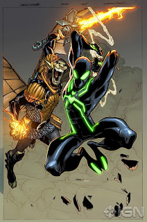
By Humberto Ramos
You must know by now how excited I get about new costumes, and whatnot, and since this is Spider-Man, I just HAD to draw this new costume. I actually REALLY like it. The costume probably makes little to no sense at all, but like I said yesterday, who CARES! It looks AWESOME! LOL
So I took a stab at it, trying to also keep up my theme of extreme perspective and foreshortening. Although, now you may say, "but Corey, this looks eerily similar to your past drawings of Spidey, and also of the Batman Beyond Drawing you just blogged a couple of days ago. What's up with that?" And I would say, yeah, you are kinda right. Not on purpose. I love flipping Spider-Man and Batman upside down, in jumping poses, so I tried to do that again here, and it did subconsciously come out very similar to previous pieces. But they are different, and really, every position has been done so many times in comics, if I come close to repeating myself sometimes, sue me. LOL I do tend to draw that same bent leg a lot to, so I do have to be careful of that. Drawing is a never ending learning process, so you have to know your short comings and just try to improve next time.
Anyway, it is what it is, and I have a BLAST drawing, digitally inking, and coloring this bad boy, so really, that's all that matters to me. I hope you like it too. Believe it or not, a LOT of planning and sketches went into this piece. For something that came out similar to positions I have closely used in the past, the process was 100 % original. I'll run down everything that went into drawing and coloring this piece below:
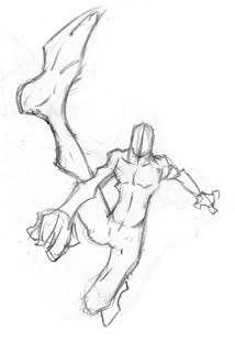 Thumbnail Sketch #1
This was the first thumbnail I did. I was just trying to get a cool areal shot of Spider-Man, so I sketched this tiny drawing out. I liked it, but wanted an more dynamic shot. Whenever I draw Spider-Man, I always try to go a little crazy with the shot. In retrospect, I probably should have done this sketch out to a finished piece. (Hmmm, Maybe I will...) But for this piece, I wanted more, so, I tried again.
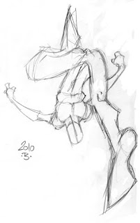 Thumbnail Sketch #2
I drew this thumbnail sketch, and I was like, BAM!, yeah, I love it. I liked the first one, but this is gonna be FUN to draw. I was convinced, so I went with this design.
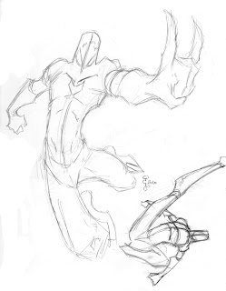 Thumbnail Sketch #3 & #4
These two sketches came next, and even though I was convinced I was drawing out thumbnail #2, I try two more poses. I do that sometimes, even if I know what the position I want to draw will be. For one reason is that, when I was working on thumbnail #2, I got a couple more ideas, so I wanted to make sure I got those ideas down on paper too. You always want to get all your ideas for a drawing out, just to make sure you know which one you really want to do. I drew these, and they were ok, and it also convinced me that yes, thumbnail #2 is the one I want.
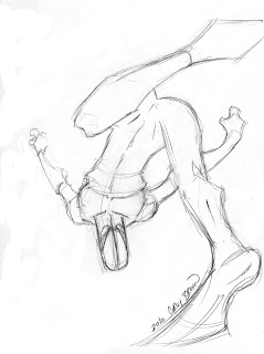 Final Sketch 8.5 x 11
So after I knew which one I wanted to do, I redrew it on 8.5 x 11 loose-leaf laser copy paper (it's the paper I love to draw on). A lot of people HATE the paper I draw on (mostly because it is hard to ink on it), but I LOVE it! I find that the laser smoothness of the paper lends itself PERFECTLY to my style and the mechanical pencil that I use (.5mm HB lead pencil). Most of the time, I go to the photocopy machine and blow up the thumbnail that I did, and then lightbox this step, but since I did all those thumbnails, I felt really loose and in the groove so I just redrew it. I think it worked out in this case, but I do usually lightbox a blown up thumbnail, if only to make sure I get it like the sketch, because that's where I felt I nailed the gesture.
 Finished Pencils on Laser Paper
Once I had the image redrawn, I just went right into the finished pencils. I love this part. The gesture and sketches are the most fun of any artist's work, they would say, and I agree, because it's where you get out those ideas that are in your brain, and those images that we see in our heads, but I also REALLY love detailing as well. It's the most relaxing part of drawing, I feel. Sketching can sometimes get frustrating because you are trying to replicate what you see in your head, and make sense of the reality of what comes out on the page. But when you get to this part, you go on auto pilot and just DRAW! Sometimes I am at this part, and all the sudden, two hours have passed, I look up, and look at the drawing and it's completed pencils. That's what happened with this piece. I looked up, and it was done, and I was like, WHOA, I did that? LOL
I also added in the classic, cheesy design oriented generic background. I love these backgrounds for pin-ups, because it gives your piece a finished look, not much goes into them, and it gives a piece a nice graphic quality to it. It's great for convention sketches, or simple pin-up work like this piece. I would not recommend it for finished comic work though, it wont fly. For something like this, for fun though, it works perfectly!
 Finished Pencils off Lightbox on Bristol
Now that the finished pencils were done, I could go straight to inks. I got out a nice comic board, and transfered the pencil image to it using my lightbox. I didn't fill in any blacks in pencil, because whats the point, it's gonna be filled in with ink. I just outlined it all off the trace. It actually works on it's own I think, oddly enough. Now was time to ink it. But before I did, I scanned all my work up to now. I like to scan all I do, no matter if I want to show it or not, just to have everything that goes into creating a piece. This is the perfect example of why I do that, to show my process. And I'm just OCD about stuff like that, lol. I scanned this step in, and realized that it's heavy enough to just go and digitally ink it. With the computer tools we have now as artists, like my AWESOME Cintique at work, why not use them. I am still going to go back and manually ink this page, because I'm gonna send it off to a fan who wants it as a commission. So I will ink this one for reals, and I'll also post that in the future, to show you all the difference between digital inks and hand drawn inks.
 Finished Digital Inks with Cintique in Photoshop CS3
So anyway, I decided to just digitally ink this piece in Photoshop. I threw up the threshold of it, and then converted it to a bitmap file. That gave me nice blacks to work from. I then zoomed in, and using my Wacom, just filled in all the blacks using a pencil. Took about half the time it would drawing it by hand, so that was cool Above is the end result! Pretty cool huh?
 Color Flats in CS3
Now that it was inked, I just went right into coloring it. This was gonna be a very fast and easy piece to color. It's mostly black, so I just throw in some blues, and then make Spidey's green glowy things pop. I just threw I grad into the background, and BAM!, I was done with the flats. Flatting is what it is called when you first start coloring a piece, and just throw in the colors, like you would just coloring a color-by-numbers image you did as a kid. It's the colorist's way of just using crayons, basically. Just get the colors in there, and you can render til your blue in the face after that. I find this process SO much fun. Other colorists I know, do NOT. I can see why, if you are coloring everyday for a living. Most colorists in the industry hire people to flat their work to save time, and focus more on the rendering. Flatting is pretty simple that anyone can do it, but I find it fun, if only to try and stay in the line, lol.
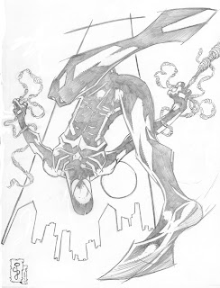
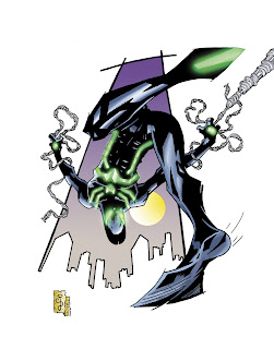
 Final Colored Image
Now that I had my colors down, I just went in with my paint brushes in Photoshop, and rendered it. I like to put my brush on multiply, and go from light to dark. Then I go back in with normal brush, and bend all the grads it created, giving it this painterly quality to it. I don't like to do selections filled with grads all too much. That's better for when you are doing classic comic books coloring, especially for interior work. Oh, and I hate using just all grads. It just comes off bad in my work, anyway. I like to get that painterly look, I think it looks better in my art. Anyway, this is the final colored piece. i was now ready to add some special effects to the piece, and make those glowing neon pieces of Spider-Man's new costume really GLOW!
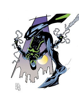
 Final Colored Image with SFX done by Jason Embury
I tried a couple of things, but wasn't happy with it. This I find to be the HARDEST part of coloring. I know things to do, and seen what the masters do first hand on every file I get in at work from them everyday, but it just never seems to work for me. Or it just takes me forever to get something that I think works and looks cool. I was having trouble with the SFX in this piece, so my good friend, and collaborator, master colorist, Jason Embury of Zenescope
to help me out with it. He is one of the BUSIEST guys I know, yet still helps me out without question, and he is so awesome for doing so! Colorists continue to be some of the NICEST & BEST people in the industry! He messed around with somethings and sent me back this as something to go by and give me some ideas.
It totally worked, and what got me to FINAL image that is posted way up at the top of this post!
Thanks for your help, Jason!
So that concludes this pin-up and the process I took to get to the finished product. I hope you like the piece, and I hope you enjoyed following me through how I work and what it takes to get to that final image. There is no one correct way to get there, it's just how I work most of the time, and a lot of people say that's just too many steps, and just too time consuming, but hey, it works for me, so it keeps me happy!
Next up is Grendel, Hunter Rose!
Until then,
Corey Breen
PS- Be sure to check out Humberto Ramos' Blog at
http://www.humbertoramos.com/blog/


